
You are on our global site | Select a market site
The logo that lives our values
When we began the journey of building Carefore Global, one guiding question consistently shaped our direction: "How can we build an ecosystem where every individual—customer, partner, or team member—feels protected, heard, and empowered to realize their fullest potential?"
From this foundational vision, the Carefore logo was born—not merely as a mark of identity, but as a strategic expression of our brand values and collective purpose.
The Embracing Curve – A Commitment to Protection and Belonging
At the core of the Carefore logo is a soft, upward curve, symbolizing protection, care, and holistic support. It represents our unwavering commitment to building a safe, inclusive environment—where every person has a place, every voice is valued, and every aspiration is nurtured. Carefore is not just about welcoming people in—it is about supporting them to grow, thrive, and lead with confidence.
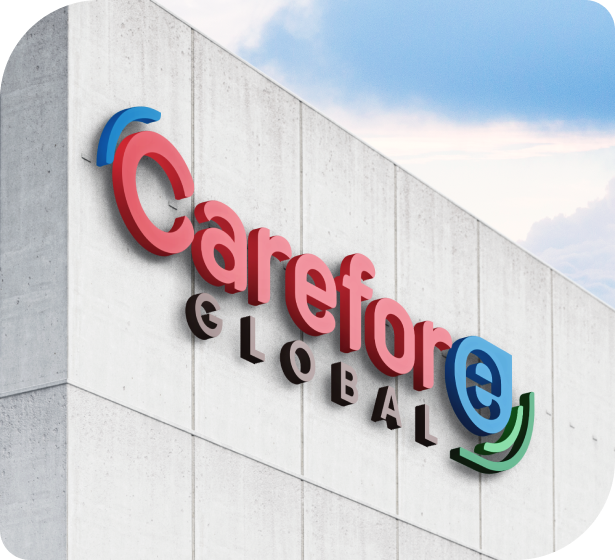

The Power of Color – Diversity as a Strategic Strength
Our vibrant color palette is more than visual—it is symbolic. Each shade represents the diverse people, backgrounds, and dreams that come together within the Carefore ecosystem to build something greater, together.
Together, these colors reflect unity in diversity—a collective of individuals from different walks of life, united by purpose and empowered to build lasting value, together.
The “E” in Carefore – For Everyone
The distinctive “E” in our logo stands for Everyone. It is a constant reminder that people are at the heart of everything we do.
Designed to resemble a drop of colostrum, the “E” is more than a letter—it's a symbol of the purest form of nourishment and protection found in nature. Colostrum, known for its immune-boosting and regenerative power, is a signature ingredient in many of our health solutions. It embodies the very foundation of life, resilience, and well-being.
By integrating the “E” in both our visual identity and our product names, we reinforce our commitment to delivering foundational health benefits for everyone, from the inside out.


Carefore is more than a business—it’s a movement built on purpose.
A movement built on trust, inclusion, innovation, and shared growth. We are here to protect, connect, and empower. So you can dream bigger, live better, and build something that lasts.
Carefore Global: Where people and purpose move forward together.